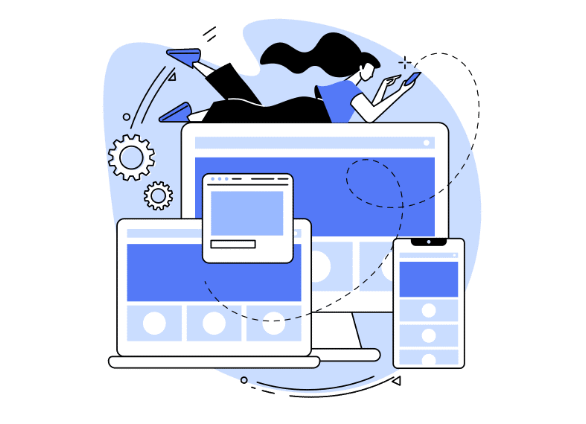
At UrbanMojos we believe that it’s always important to keep browsing devices in mind whenever you design a website. Nowadays there are so many different devices users use to browse the internet and your website, it becomes almost compulsory to make a good responsive layout for your website. Thus our UrbanMojos WordPress team has compiled some important steps you should follow so that you can make a very responsive WordPress Website.
Why its important to make website layout responsive for your website ?
As they say User Experience decides on how your website is reviewed all over the internet. Thus responsive design ensures that a website adapts seamlessly to different screen sizes and devices, providing an optimal user experience regardless of the device used. Here’s why responsive design is essential:
1. Enhanced User Experience

A responsive design ensures that users can easily navigate and interact with your site on any device. This enhances user satisfaction and encourages them to stay longer on your site, reducing bounce rate. Thus this also adds in the page loading speed of the website.
2. Increased Mobile Traffic
As more and more global website traffic nowadays is coming from Mobile Devices thus its important your website is responsive towards mobile devices having different resolutions and screen sizes so that your website looks great on all types of screens.
3. Improved SEO

As we all know search engines like Google rely on web crawlers to index different websites, web pages and posts on the website. Search engines like Google prioritize mobile-friendly websites in their rankings. A responsive design improves your site’s visibility in search engine results, driving more organic traffic.
4. Cost Efficiency

Maintaining a single responsive website is more cost-effective than creating separate websites for desktop and mobile users. It reduces development and maintenance costs while ensuring a consistent brand experience. So in this way, you don’t have to make multiple changes for different websites for different resolutions and screen sizes.
5. Adoptive & Responsive website for the future also

A responsive design adapts to various screen sizes and resolutions, including new devices. This future-proofs your website against the ever-evolving landscape of internet-connected devices.
How to Build a Responsive Website
Creating a responsive website involves several key steps. Here’s a detailed guide to help you get started:
1. Using a Fluid Grid Layout

A fluid grid layout uses relative units like percentages instead of fixed units like pixels. This allows your design to adapt to different screen sizes.
Steps to Implement a Fluid Grid Layout:
- Set up a grid system with relative units.
- Define the layout in terms of columns and rows.
- Ensure that elements resize proportionally by using percentages.
2. Apply Flexible Images

Flexible images adjust their size according to the screen dimensions. Use CSS to set maximum widths and heights in relative units.
Steps to Apply Flexible Images:
- Set the max-width property to 100% in your CSS.
- Ensure that images do not exceed their container size.
3. Utilize Media Queries

Media queries allow you to apply different styles based on the device’s characteristics, such as width, height, and resolution.
Steps to Use Media Queries:
- Add media queries to your CSS file.
- Define breakpoints where the design changes to accommodate different screen sizes.
- Apply specific styles for each breakpoint to ensure a responsive design.
4. Implement a Mobile-First Approach

Design your website for mobile devices first and then scale up for larger screens. This approach ensures that your site is optimized for the smallest screens first.
Steps for a Mobile-First Approach:
- Start with a simple, single-column layout.
- Add styles for larger screens using media queries.
- Ensure that the design is enhanced progressively for larger devices.
5. Optimize Typography

Use scalable and readable fonts that adjust according to screen size. Relative units like ems and rems help maintain consistency across different devices.
Steps to Optimize Typography:
- Set the base font size in relative units.
- Use media queries to adjust font sizes for different screen sizes.
- Ensure line height and spacing are appropriate for readability.
6. Test Across Multiple Devices

Regularly test your website on various devices and browsers to ensure that it looks and functions as intended.
Steps to Test Responsiveness:
- Use tools like BrowserStack or Responsinator to test on multiple devices.
- Check for consistency in layout, functionality, and performance.
- Make necessary adjustments based on testing results.
UrbanMojos’s Interesting Facts About Responsive Design
61% of users are unlikely to return to a mobile site they had trouble accessing, and 40% visit a competitor’s site instead.
- Google introduced mobile-first indexing in 2018, meaning it predominantly uses the mobile version of content for indexing and ranking.
- Responsive design is a standard best practice recommended by Google for improving user experience and SEO.
- The global mobile population stands at over 5 billion unique users, making mobile optimization indispensable.
- Sites that load within 5 seconds see 70% longer average sessions and 35% lower bounce rates.
As we know there are multiple technologies and frameworks which we can use to develop a responsive website. Hence our team has compiled a comparison between some widely used technologies for responsive frameworks for websites. You can refer this below table to make a choice on frameworks you want to use to design your website.
| Framework | Key Features | Ease of Use | Popularity | Best For |
|---|---|---|---|---|
| Bootstrap | Extensive components, grid system, responsive utilities | High | Very High | Beginners, Rapid Development |
| Foundation | Advanced responsive features, flexible grid, accessibility features | Medium | High | Advanced Users, Large Projects |
| Bulma | Flexbox-based, modular design, clean syntax | High | Medium | Designers, Clean Code |
| Tailwind CSS | Utility-first framework, highly customizable, responsive utilities | Medium | Increasing | Custom Designs, Developers |
| Materialize | Based on Google’s Material Design, mobile-first, built-in components | High | Medium | Modern, Material Design Projects |
Frequently Asked Questions on Responsive Website Design :
Responsive design is a web design approach that ensures a website adapts and looks good on all devices, including desktops, tablets, and smartphones. It uses flexible layouts, images, and CSS media queries to achieve this.
Responsive design is important because it provides a seamless user experience across different devices, increases mobile traffic, improves SEO, is cost-efficient, and future-proofs your website.
Responsive design positively impacts SEO by improving user experience, reducing bounce rates, and meeting Google’s mobile-friendly criteria, which can boost your search engine rankings.
A fluid grid layout uses relative units like percentages instead of fixed units like pixels. This allows the layout to resize proportionally based on the screen size, ensuring a responsive design.
Media queries are a CSS technique used to apply different styles based on the device’s characteristics, such as width, height, and resolution. They help create responsive designs by defining breakpoints for different screen sizes.
The mobile-first approach is a design strategy that starts with designing for mobile devices first and then scales up for larger screens. This ensures that the design is optimized for the smallest screens first, providing a better user experience on mobile devices.
Popular responsive frameworks include Bootstrap, Foundation, Bulma, Tailwind CSS, and Materialize. Each framework offers unique features and benefits for different types of projects.
You can test your website’s responsiveness using tools like BrowserStack, Responsinator, or the built-in responsive design mode in web browsers’ developer tools. Regular testing on actual devices is also recommended.
If you want to explore free responsive WordPress themes you can read our article Top 5 Blazing fast Responsive WordPress Themes